Showing posts with label rebranding. Show all posts

Sunday, May 24, 2009

AKA "Jill sent me" Discount/Love

Stacey (AKA AsspocketProductions AKA StampinNaughty AKA Amazing Arts) rules. Those two stamps (only with my full address...had to white out parts so my loyal blog followers wouldn't come to my house and kill me in my sleep or anything...this means you Interlochen Amy) should be heading my way once Memorial Day is over and done with. Yay!

And here's the real kicker: Stacey is offering you, my blog readers, 15% off her stamps (that means stamps, not books, cases, acrylic blocks and the like) if you say "Jill sent me" in a convo or when you check out.

Persoanlly, I've come to use stamps in place of my love of stickers for decorating packages and branding things. Like I said yesterday, you run out of stickers. Stickers have to be replenished and I always feel like I have to wait for a special package or occasion to use a special sticker. Not with a stamp. Using a stamp doesn't take away from using it again. It's like love. That's why when I send people things (both official Etsy orders and random mail to random friends and family) the envelopes tend to show up covered in stamps. It's like covering the package in love.

So if you're looking to buy some love, say "Jill sent me" and Stacey will discount said love 15%. And no, I'm not getting kickbacks or anything. Just spreading the love.

Saturday, May 23, 2009

lettering, stamping, branding, and oh my!

What? I have a blog? Oh, right.
Last few weeks have been completely insane with non-business-related things (local bff moving away forever, trips to surrounding "i" states, friends visiting, condo on the brain) but I'm trying to get myself back to work so I can have my rebranding done and my Off the Wall Greetings shop up and gorgeous by June.

You know that lovely banner Bean Sprout Studios designed for me? In the interest of branding and consistency and all that fun marketing crap that just makes "it looks and feels better" sound like deep psychological manipulation, I asked her what font she used. Turns out to be "Lettering Delights Letterpress" from scrapgirls.com. For $3, I decided it was worth paying, even though I normally stick to the free fonts from DaFont.com. I've been through DaFont over and over again and for $3 I can Lettering Delights Letterpress my brains out on everything and be done with it.

Thing already in the works with my new name and font: a stamp from Stacey of AsspocketProductions that says offthewallgreetings.etsy.com so I can stamp the insides of all my envelopes and the outsides of all my packages and your forehead. I really like her work and she's a fellow Illinoisian. I'm buying one of her fabulous custom Chicago Skyline address stamps, too, so I can stamp my new permanent condo address like a cool person all over everything. Way better than address labels, since I never know how many labels I'll use and at some point you either move with tons left over or you have to keep reordering them or using the weird ones from awkward charities like the Foreskin Foundation*. Stacey also has a whole fantastic shop of naughty stamps appropriately named Stampin Naughty, but I know I'd just get myself into trouble with those.


*I made that up.

Thursday, April 2, 2009

Color Thought

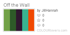
Off_the_Wall
Color by COLOURlovers

Far from perfect, but I was reading How Color Choices in Stores Can Influence Your Shopping Decisions (again, found through COLOURlovers.com) and I'm thinking I want a combination of light and dark greens accented with something bright in the yellow/orange/red area for subliminal messaging purposes (placating and wealthy but fun and active!) except just those colors looked ugly so I played with them until I got this thing which I could live with.

Other potential favorite:
Bike
Color by COLOURlovers

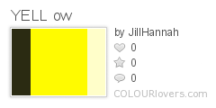
If I go with the yellow "optimism" concept instead:
YELL_ow
Color by COLOURlovers

thoughts?

Also, I have an econ post coming as soon as I write it...must...write...it...

Monday, March 30, 2009

Hey, baby, what's your color?

So obviously I've spent most of my not-in-bed-with-terrible-migraine time today on COLOURlovers.com coming up with a palette to exactly match the colors in my rug, then stalking all the other color palettes and Pantone trends and whatnot for ideas.

In my COLOURlovers forum lurking, I discovered Colourism. It's like numerology but with color. You input your first and last names, birthday, and VOILA! It tells you what your unique color is! Here's mine:

I think it suits me quite well, actually. It's not my favorite color, but it's a good description of me, somehow.

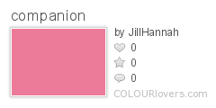
And mycompanion color:

companion
Color by COLOURlovers

Which I don't love, particularly with "my" color, but it is the sort of pink that, by itself, I can almost stand. The mauvey pink.

So what's your color?

Sunday, March 29, 2009

more awesome


BeanSproutStudio Amy is awesome. Awesome awesome awesome. I still have to pick my color scheme if it's going to be branding my universe. I like the orang a lot, but maybe something other than the light blue? I usually gravitate towards red and purple, but I'm flexible, especially since I'm really liking these colors but I might get sick of them together long-term.

Perhaps I'll spend a few hours on COLOURlovers.com. It's one of my favorite time sucks already. You can create/discover your own, rate, and comment on other people's colors, then use those colors to create palettes and use palettes to create patterns. Basically, it's a celebration of color and color in contrast with other color and using those colors as design elements.

From their about page:

COLOURlovers™ is a resource that monitors and influences color trends. COLOURlovers gives the people who use color - whether for ad campaigns, product design, or even in architectural specification - a place to check out a world of color, compare color palettes, submit news and comments, and read color related articles and interviews.
You get the idea. Anyway, I'll probably be using it already to choose paint colors for the condo I bought today, so why not?

Friday, March 27, 2009

In Love

This morning, I woke up to a convo from Amy (not the one I generally talk about, but apparently people named Amy are all awesome) of BeanSproutStudio that included two banners she'd put together having read my whining and freaking out. When I saw the first one, I couldn't believe it. It's the banner that I've been dreaming of from the start. The damask background, the font that looks stamped but is nice and blocky and legible but still askew and "off the wall"-ish...

I think more color would be good, but considering this was charity banner from a person who doesn't know me in real life, I think I have to marry her and have ten thousand of her babies and make her my new best friend. Because seriously, that is so close to what was in my mind but I couldn't do. You should go buy birth announcements and pretty-not-snarky cards from her. Lots of them.

Thursday, March 26, 2009

yikes

Apparently, my banner is a "design disaster." There's a number of people who agree. I threw it up in my JillHannah Etsy shop just to get some quick feedback, and "design disaster" is the consensus. Pisswrinkles. Part of that is the fact that, for whatever reason, the text is coming out all pixely. I don't know why and I don't know how to fix it. But I'm also getting comments about the colors not meshing and "design disaster" isn't something people are saying cruelly or lightly.

So what the hell should my banner and shop redesign look like? I don't have money to spend on professionals who will also take the time to really research my particular market and product and what will best connect the two. Hell, I don't even know if there are any real marketing-psychology trained designers out there. There should be. But for my little tiny business purposes, I just want something that gives the feel of both the wallpaper business card envelopes and the snarky cards. Like the name does. The name is perfect. I want a look to match.

Brainstorms, people!!!

Tuesday, March 24, 2009

Bannerama-ding-dong-YEAH!

Spend enough time obsessing over your rebranding as a distraction from the fact you feel like total and complete crap and eventually, you get somewhere.
I've worked very hard on this. When my head is being particularly bad for more than just a day, I like to have high-concentration high-creativity but very positive and productive-feeling and low-real-stress projects to keep me distracted. Crafting and Etsy businessy stuff in general is great for it. Kakuro and sudoku and crossword and any other puzzles are good, too, unless my brain starts doing its weird misfire thing and then I get frustrated, but at that point in the migraine I get frustrated by most tasks and if I can't stand watching movies I just sleep.

But I discovered the "torn paper" filter on Adobe Photoshop. After fake tearing down my scanned wallpaper (which I already messed with levels-wise to make it pop better) with the lasso tool, I discovered I had to actually apply the torn paper filter (found under "sketch") to a white background surrounding my wallpaper edge. Then I just futzed with it until I liked how it looked.

After a number of solid colors and patterns behind the wallpaper, I realized it should look like it was torn away from something. Distract brain from pain by going through different ideas and...sky! Yes, sky would be lovely. So I found a public domain image of the sky, messed with it (i.e. stretched out one particular corner that had the exact amount of clouds I wanted and played with the hue and saturation) until I was happy, and VOILA!

Then, the hardest part. Font. Back to dafont.com. Back through all the script fonts and the stencil fonts and some of the fonts I already have and just like. Try them all on my new background banner. Make sure they're not too long horizontally or too illegible or too pixely or too stupid. Something that feels right. My favorite visually is still too hard to read. It's called "Fountain Pen Frenzy" and it's got the exact look and feel I want, but I'm afraid if you didn't know what it said, you wouldn't be able to decipher it and that kind of defeats the purpose. Observe:So that's clearly a no-go. There were a few fonts that have the fabulous real pen-and-ink letter writing look, but it seems they generally have a harder time translating onto anything but a solid white background in their original size without looking weird.

I also really like the FELL font family in general and kind of like this version, too:Plus on this one I played with barely hiding the letters behind the wallpaper. Same goes for the version with the highest ranked font from the old version of the banner. I can't decide if I still like it, though...
SO! Redesignmania is nearing its end. I still need to get my photographer friend over here and actually make a final decision on font (real comment input is wonderfully helpful...I'll stop tormenting you with polls for now, though I may set up a quick final one and beg the EtsyGreetings Team for votes). And if you read this whole blog post, mazel tov. You are awesome. You totally deserve 20% off your first purchase from Off the Wall Greetings once it exists, or any purchase from JillHannah in the meantime, but only if you give me feedback in my comments ;)

Yes, I just emoticonned.

Fin.

Wednesday, March 18, 2009

HELP!!!!!

I chose the name "Off the Wall Greetings" because I'm selling WALLpaper envelopes and snarky off-beat cards and I liked that the name covered both.

How do I make my banner and visual branding cover both? Something that won't put off my business card envelope clientele or my poop card purchasers?

Apparently, Wisconsin just paid $50,000 for a new logo and slogan, so I no longer feel too bad about my own troubles rebranding myself. (Thanks to Elizabethjewelry for posting the article to the Etsy forums.)
Branding and marketing and image are a whole huge businessy beast unto themselves, and while I like to think I'm pretty good at them, it's much harder and scarier to do for yourself. So, help! You can see my banners below and vote, but no one sounds too enthused and I'd love some suggestions, ideas, or HELP of any sort. Preferably costing less than $50,000.

PS- Here's two more banner attempts to add to the voting pile

Banner 4:
Banner 5:

Saturday, March 7, 2009

sweet, sweet trading


I'm trading 50 of my business card sized thank you notes with wallpaper envelopes for the motherload of bath and body products from Mirasol Farm: one rosemary mint lotion, one lavender lotion bar, one sweet eucalyptus soap, one orange clove soap, one kitchen soap, and one double mint soap. I'm very addicted to handmade soaps and like to try new shops all the time, so when she approached me about a trade and wanted up to 50 cards I was a kid in a candy shop. For those of you who've read my past soap-related posts, you know how much I love all things rosemary; Mirasol Farm's kitchen soap is rosemary orange, and since she uses all the natural ingredients instead of fragrancey crap, this strikes me as a completely brilliant innovation. We'll see how long this bar lasts in the kitchen or if it has to migrate into my shower and/or be permanently installed in my nostrils.

BUT!

Because it's 50 cards and I asked my usual "do you have any preferences" question (i.e. love/hate plaids, florals, damask, the color pink, etc.) and she mentioned liking blue and orange, I decided to make a whole bunch of fresh envelopes yesterday in blues and oranges. And then I found I had some wallpapers with what look like sunflowers ("mirasol" is "sunflower" in Spanish) so I had to include a bunch of those...

BUT BUT!!

now I'm stopping myself.
I've made enough.
No more.

Because these all have the "jillhannah.etsy.com" stamp in them, and I'm trying to switch my universe to the Off The Wall Greetings branding, which can commence very soon (my clever business deal will likely be the subject of my next post).

SO!

Now I have to finish up this batch by folding them all, take my photos and make the listing for mirasolfarm, and ship whatever 50 I end up deciding make the most sense in blues and oranges and sunflowers but still get some others in for variety.

And then my sweet, sweet soaps and lotions can come to me and I will be delicious.

I need to do a post on the importance of trading in this economy. Maybe later.